Milano Location History
The goal of this post is to visualize time spent in various Milanesi neighborhoods using Google location data and Python * This post utilizes code from Tyler Hartley’s visualizing location history blog post
Overview
- Setup
- download data
- install modules
- Data wrangling
- data extraction
- data exploration
- Working with Shapefiles in Python
- Prep data and pare down locations
- Compute your measurement metric
- Choropleth Plot
- Hexbin Map
Setup
- Use Google Takout to download your Google location history
- If you’ve previously enabled Google location reporting on your smartphone, your GPS data will be periodically uploaded to Google’s servers. Use Google Takeout to download your location history.
- The decisions of when and how to upload this data are entirely obfuscated to the end user, but as you’ll see below, Android appears to upload a GPS location every 60 seconds. That’s plenty of data to work with.
- After downloading your data, install the required modules
Google Takeout
Google Takeout is a Google service that allows users to export any personal Google data. We’ll use Takeout to download our raw location history as a one-time snapshot. Since Latitude was retired, no API exists to access location history in real-time.
Download location data: * Go to takeout. Uncheck all services except “Location History” * The data will be in a json format, which works great for us. Download it in your favorite compression type. * When Google has finished creating your archive, you’ll get an email notification and a link to download. * Download and unzip the file, and you should be looking at a LocationHistory.json file. Working with location data in Pandas. Pandas is an incredibly powerful tool that simplifies working with complex datatypes and performing statistical analysis in the style of R. Chris Albon has great primers on using Pandas here under the “Data Wrangling” section.
Install modules
- If you use Anaconda to manage your Python packages, I recommend creating a virtual environment with anaconda to install the dependencies. Copying the lines below the instruction into the terminal creates the environment, requirements.txt, etc.
- conda create -n test-env python=3.5 anaconda
- source activate test-env
- make a requirements.txt file for dependencies
- (echo descartes; echo IPython; echo shapely; echo fiona; echo Basemap) >> requirements.txt
- install requirements.txt
- conda install –yes –file requirements.txt
- Windows users:
- create a python2.7 environment to install relevant modules
- conda create -n py27 python=2.7 anaconda
- source activate py27
- Download and install Microsoft Visual C++ Compiler for Python 2.7
- pysal from https://www.lfd.uci.edu/~gohlke/pythonlibs/
After completing the setup, we’ll read in the LocationHistory.json file from Google Takeout and create a DataFrame.
Data Wrangling
Explore Data
accuracy                     int64
activity                    object
altitude                   float64
heading                    float64
latitude                   float64
longitude                  float64
timestamp                  float64
velocity                   float64
verticalAccuracy           float64
datetime            datetime64[ns]
dtype: object
| count |
745660.000000 |
101260.000000 |
44100.000000 |
745660.000000 |
745660.000000 |
7.456600e+05 |
58874.000000 |
4921.000000 |
| mean |
58.997173 |
67.057525 |
186.597551 |
37.748367 |
-102.506537 |
1.417774e+09 |
7.769678 |
23.099776 |
| std |
125.358984 |
242.209547 |
101.643968 |
9.004123 |
23.609836 |
3.356510e+07 |
11.790783 |
45.139324 |
| min |
1.000000 |
-715.000000 |
0.000000 |
13.689757 |
-123.260751 |
1.376790e+09 |
0.000000 |
2.000000 |
| 25% |
22.000000 |
-18.000000 |
98.000000 |
29.817569 |
-122.306596 |
1.391259e+09 |
0.000000 |
2.000000 |
| 50% |
31.000000 |
2.000000 |
181.000000 |
29.986634 |
-95.246060 |
1.413249e+09 |
1.000000 |
2.000000 |
| 75% |
50.000000 |
60.000000 |
270.000000 |
47.664284 |
-94.995603 |
1.428049e+09 |
13.000000 |
30.000000 |
| max |
999.000000 |
6738.000000 |
359.000000 |
50.105984 |
23.782015 |
1.519330e+09 |
208.000000 |
473.000000 |
- accuracy code “999” may represent missingness
- find earliest and latest observations in the data
earliest observed date: 08-17-2013
latest observed date: 02-22-2018
location_data is a Pandas DataFrame containing all your location history and related info.- columns include latitude, longitude, and a timestamp. additional columns are accuracy, activity, altitude, heading, and velocity.
- all we’ll need is latitude, longitude, and time.
Working with Shapefiles in Python
Shapefile is a widely-used data format for describing points, lines, and polygons. To work with shapefiles, Python gives us shapely. To read and write shapefiles, we’ll use fiona.
To learn Shapely and write this blog post, I leaned heavily on this article from sensitivecities.com.
First up, you’ll need to download shapefile data for the part of the world you’re interested in plotting. I wanted to focus on my current home of Milano, which like many cities provides city shapefile map data for free. It’s even broken into city neighborhoods! Tom MacWright has GIS with Python, Shapely, and Fiona overview for more detail on Python mapping with these tools
Next, we’ll need to import the Shapefile data we downloaded from the geoportale.comune.milano.it link above
- used the steps suggested in this post to save the Milano.shp file CRS system to WGS84
- Use Basemap to plot the shapefiles
Prep data and pare down locations
The first step is to pare down your location history to only contain points within the map’s borders.
| 84 |
TICINESE |
POLYGON ((11630.09398147638 7450.375391480873,... |
| 85 |
CANTALUPA |
POLYGON ((9103.651029835517 3586.401798879733,... |
| 86 |
PARCO DEI NAVIGLI |
POLYGON ((8963.725031880311 3321.837383000022,... |
| 87 |
PAGANO |
POLYGON ((9933.632072928249 9060.827339615005,... |
| 88 |
GARIBALDI REPUBBLICA |
POLYGON ((12564.62148112342 11062.39099056072,... |
total data points in this period: 745660
total data points in the city shape file for this period: 14231
2.0% of points this period are in the city shape file
Now, city_points contains a list of all points that fall within the map and hood_polygons is a collection of polygons representing, in my case, each neighborhood in Milano.
Compute your measurement metric
The raw data for my choropleth should be “number of points in each neighborhood.” With Pandas, again, it’s easy. (Warning - depending on the size of the city_points array, this could take a few minutes.)
- view most popular neighborhoods by counts
| 21 |
EX OM - MORIVIONE |
POLYGON ((12701.8400366421 5749.665425603603, ... |
5961 |
99.350000 |
| 83 |
VIGENTINA |
POLYGON ((12395.06694475143 7416.000147188619,... |
3087 |
51.450000 |
| 32 |
GUASTALLA |
POLYGON ((13179.99521035373 9628.809211483189,... |
2599 |
43.316667 |
| 34 |
DUOMO |
POLYGON ((11199.51571519782 9304.427052039622,... |
603 |
10.050000 |
| 36 |
MAGENTA - S. VITTORE |
POLYGON ((10933.59503462748 9188.373696373419,... |
476 |
7.933333 |
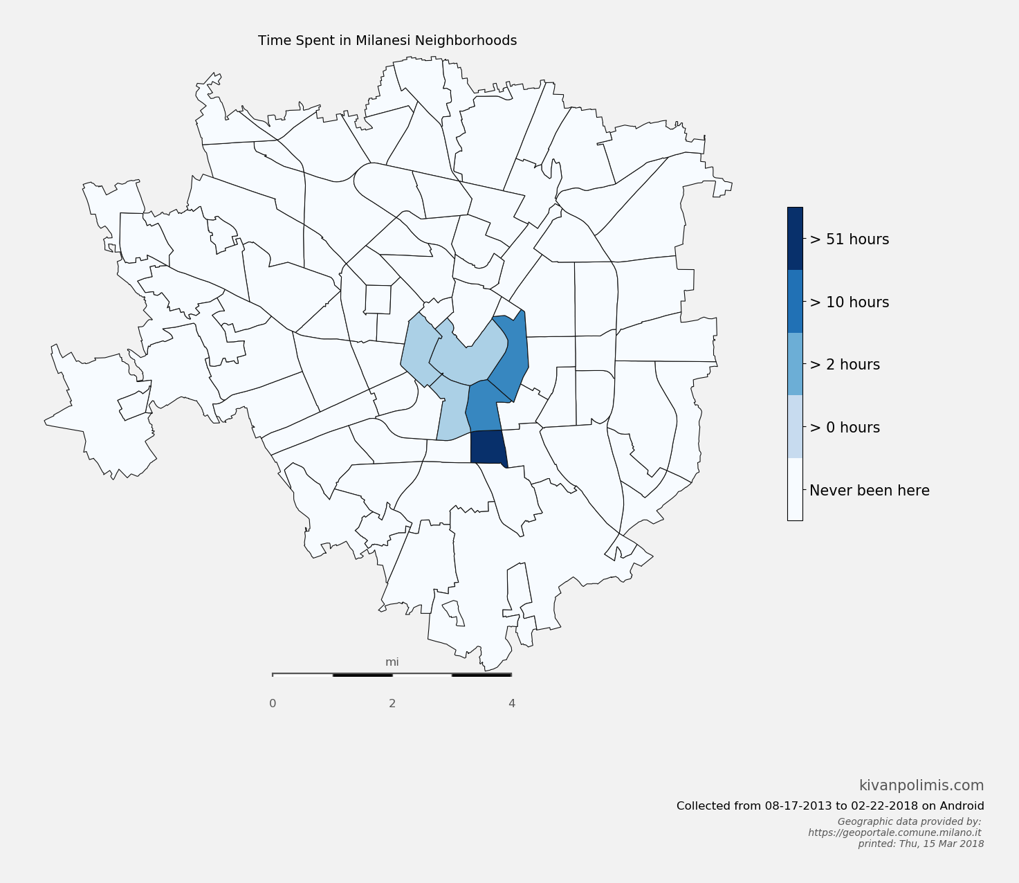
42.0% of points this in the city shape file are from the EX OM - MORIVIONE
So now, df_map.hood_count contains a count of the number of GPS points located within each neighborhood. But what do those counts really mean? It’s not very meaningful knowing that I spent any n “counts” in a neighborhood, except to compare neighborhood counts against each other. And we could do that. Or we could convert hood_count into time
Turns out, converting counts into time is straightforward. From investigating the location history, it seems that unless the phone is off or without reception, Android reports you location exactly every 60 seconds. Not usually 60 seconds, not sometimes 74 seconds, every 60 seconds. It’s been true on Android 4.2+. Hopefully that means it holds true for you, too. So if we make the assumption that my phone is on 24/7 (true) and I have city-wide cellular reception (also true), then all we need to do is hood_count/60.0, as shown above, and now we’ve converted counts to hours.
Choropleth Plot
- The code for creating this hexbin map below is in
choropleth.py
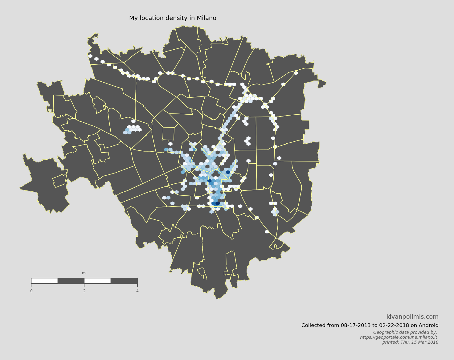
Hexbin Map
We can also take a different approach to choropleths, and instead of using each neighborhood polygon as a bin, let Basemap generate uniform hexagonal bins for us. Hexbin maps are great way to visualize point density because all bins are equally sized. Best of all, it requires essentially no extra work as we’ve already defined our neighborhood Patches and paired down our location data. The code for creating this hexbin map below is in hexbin.py
Potential future directions
- Figure out where you usually go on the weekends
- Investigate your commute time by day of the week
- measure the amount of time you spend driving vs. walking vs. biking
Download this notebook, or see a static view here
System and module version information:

Python version:
 sys.version_info(major=2, minor=7, micro=14, releaselevel='final', serial=0)

last updated: Thu, 15 Mar 2018 05:00
Source: Milano Location History