This post is the first in a series that demonstrate how to make shot charts by combining the Python module nba_api with the visualization modules matplotlib and seaborn.
Overview
Background
Data Collection
Data Visualization
Review
References
Background
In 2012, at the \(6^{th}\) annual Sloan Sports Conference at MIT, geographer and basketball enthusiast Kirk Goldsberry unveiled the shot chart and revolutionized basketball analytics with his paper CourtVision: New Visual and Spatial Analytics for the NBA. Goldsberry’s shot chart (Figure 1, shown below) is a heatmap visual representation of the location, frequency, and accuracy of a player’s shot performance. The key intution behind shot charts is that spatial analytics provide more player insight than traditional boxscore numbers like field goal percentage. Shot charts provide insights into player tendencies (where they shoot, how successful), allow for comparison between players, and provide a a sense of what players complement each other based on location preferences/style of play. Goldsberry’s spatial analytics along with John Hollinger’s PER were part of the first wave of advanced analytics being introduced to basketball and represent the dawn of basketball’s “Moneyball” era where basketball front office’s started to seriously use advanced analytics in decision making.
NBA teams were so impressed by spatial analytics that the league partnered with SportVU and then Second Spectrum to track player movement for the entire league. Teams like the Los Angeles Clippers have invested even more in spatial analytics and have started to leverage artificial intelligence to analyze player and team performance. This post repurposes code from indivudual and collaborative work by Savvas Tjortjoglou and Bradley Fay, key contributors to Python’s py-Goldsberry module (created and maintained by Bradley Fay). See the References section for links to code by these authors
To make Goldsberry’s shot charts and use spatial analytics, we first need to get the player location data that is compiled by NBA partner Second Spectrum. The NBA makes this data available for consumption through an API (Application Programming Interface) and a group of Python developers created a module, nba_api, to leverage the NBA’s API. One of the API endpoints wrapped in the nba_api module is the Shot Chart endpoint. This endpoint provides a shotchartdetail DataFrame with the X and Y coordinates for all shots taken by a given player.
Code
from nba_api.stats.static import players, teamsfrom nba_api.stats.endpoints import shotchartdetailfrom matplotlib.offsetbox import OffsetImageimport matplotlib.gridspec as gridspecfrom IPython.display import displayfrom typing import List, Dictfrom utils import draw_court, create_joint_shot_chart, SeabornFig2Gridimport matplotlib.pyplot as pltimport urllibimport pandas as pdimport numpy as npimport seaborn as snsimport json
Gathering the Data
We can use the nba_api module to create databases of teams and players. Once we have these databases, we can filter along individuals or teams to make shot charts
total_players =len([player for player in players_dict])total_teams =len([team for team in teams_dict])print(f"there are {total_players} in the players database and {total_teams} in the teams database")
there are 4723 in the players database and 30 in the teams database
the players submodule from the nba_api module has a function, find_players_by_full_name, that we can use to get the player dictionary information for a given player. the function returns a list that we can take the first element from to create the player dictionary. let’s use the find_players_by_full_name function to filter the players submodule (a list of player dictionaries), for Kobe Bryant’s information and then explore the player dictionary
similar to the find_players_by_full_name function from the players submodule, the teams submodule has a function find_teams_by_nickname that allows us to filter the teams submodule database of teams to get information on a team by using their nickanme. let’s use the find_teams_by_nickname to get information for Kobe’s lifelong team, the Los Angeles Lakers
now we can use the id field from the player dictionary to get player location data. we’ll start out with a player location data for an entire year, but shot chart data can be gathered for an individual game. We’ll use Kobe Bryant’s player id (977) and team id (1610612747) to gather the location of all shots from two seasons in Kobe Bryant’s career: his 2007-2008 MVP season and final season in 2015-2016 with the shotchartdetail function. shotchartdetail makes a call to the shot chart endpoint with the parameters supplied in the function
in the next post, we’ll make a function to leverage the leaguegamefinder endpoint to get individual game ids for shot chart creation on the game-level instead of the season-lvel. right now, let’s examine the data provided by the shot chart endpoint. The dictionary from the API response has three keys, and the X and Y coordinate data is in the resultSets dictionary
we can convert the resultSets dictionary into a DataFrame to aid in analysis
Code
headers = kobe_shot_chart_2008_content['resultSets'][0]['headers']# Grab the shot chart datakobe_2008_shots = kobe_shot_chart_2008_content['resultSets'][0]['rowSet']# combine shot chart data and headers into a DataFramekobe_2008_shots_df = pd.DataFrame(kobe_2008_shots, columns=headers)# View the head of the DataFrame and all its columnswith pd.option_context('display.max_columns', None): display(kobe_2008_shots_df.head())
GRID_TYPE
GAME_ID
GAME_EVENT_ID
PLAYER_ID
PLAYER_NAME
TEAM_ID
TEAM_NAME
PERIOD
MINUTES_REMAINING
SECONDS_REMAINING
EVENT_TYPE
ACTION_TYPE
SHOT_TYPE
SHOT_ZONE_BASIC
SHOT_ZONE_AREA
SHOT_ZONE_RANGE
SHOT_DISTANCE
LOC_X
LOC_Y
SHOT_ATTEMPTED_FLAG
SHOT_MADE_FLAG
GAME_DATE
HTM
VTM
0
Shot Chart Detail
0020700002
4
977
Kobe Bryant
1610612747
Los Angeles Lakers
1
11
29
Missed Shot
Jump Shot
2PT Field Goal
Mid-Range
Center(C)
16-24 ft.
21
54
209
1
0
20071030
LAL
HOU
1
Shot Chart Detail
0020700002
19
977
Kobe Bryant
1610612747
Los Angeles Lakers
1
9
19
Missed Shot
Layup Shot
2PT Field Goal
Restricted Area
Center(C)
Less Than 8 ft.
0
0
0
1
0
20071030
LAL
HOU
2
Shot Chart Detail
0020700002
23
977
Kobe Bryant
1610612747
Los Angeles Lakers
1
9
1
Made Shot
Layup Shot
2PT Field Goal
Restricted Area
Center(C)
Less Than 8 ft.
0
0
0
1
1
20071030
LAL
HOU
3
Shot Chart Detail
0020700002
31
977
Kobe Bryant
1610612747
Los Angeles Lakers
1
7
56
Made Shot
Jump Shot
2PT Field Goal
Mid-Range
Center(C)
16-24 ft.
20
51
201
1
1
20071030
LAL
HOU
4
Shot Chart Detail
0020700002
48
977
Kobe Bryant
1610612747
Los Angeles Lakers
1
6
6
Missed Shot
Jump Shot
3PT Field Goal
Above the Break 3
Right Side Center(RC)
24+ ft.
26
121
237
1
0
20071030
LAL
HOU
Code
kobe_2016_shots = kobe_shot_chart_2016_content['resultSets'][0]['rowSet']# combine shot chart data and headers into a DataFramekobe_2016_shots_df = pd.DataFrame(kobe_2016_shots, columns=headers)
get_shots_df_by_season collapses the last few lines of code into a function to create a shot dataframe. the function takes the following parameters
team_dict
player_dict
season
let’s get kobe’s rookie season shot dataframe with this functon
Code
def get_shots_df_by_season(team_dict: Dict, player_dict: Dict, season: str):""" """ shot_chart_response = shotchartdetail.ShotChartDetail( team_id=team_dict.get("id"), player_id=player_dict.get("id"), season_nullable=season, season_type_all_star='Regular Season', context_measure_simple='FGA' ) shot_chart_content = json.loads(shot_chart_response.get_json()) headers = shot_chart_content['resultSets'][0]['headers']# Grab the shot chart data shots = shot_chart_content['resultSets'][0]['rowSet']# combine shot chart data and headers into a DataFrame shots_df_by_season = pd.DataFrame(shots, columns=headers)return(shots_df_by_season)
print(f"in 1996 Kobe attempted {kobe_1996_total_shots} shots and made {kobe_1996_made_shots}, missing {kobe_1996_missed_shots}")print(f"in 2008 Kobe attempted {kobe_2008_total_shots} shots and made {kobe_2008_made_shots}, missing {kobe_2008_missed_shots}")print(f"in 2016 Kobe attempted {kobe_2016_total_shots} shots and made {kobe_2016_made_shots}, missing {kobe_2016_missed_shots}")print(f"Kobe's shooting percentage was {kobe_2008_shooting_pct}% compared to {kobe_2016_shooting_pct}% in 2016 and {kobe_1996_shooting_pct}% in 1996")
in 1996 Kobe attempted 422 shots and made 176, missing 246
in 2008 Kobe attempted 1690 shots and made 775, missing 915
in 2016 Kobe attempted 1113 shots and made 398, missing 715
Kobe's shooting percentage was 45.86% compared to 35.76% in 2016 and 41.71% in 1996
Data Visualization
To create our V1 shot chart, we need: 1. a scatter plot of player shots 2. a basketball court overlayed onto the scatter plot to understand where on the court shots were taken.
We can achieve these two goals by combining and matplotlib and seaborn, two powerful Python visualization libraries. matplotlib is a powerful visualization library capable of producing 2D, 3D, and interactive visualizations. seaborn is based on matplotlib and allows for high-level visualizations that incorporate statistics. Lastly, I use code from Bradley Fay to create an NBA court, Fay’s function draws all aspects of an NBA (half)court including the restricted area, free throw line, and three point line.
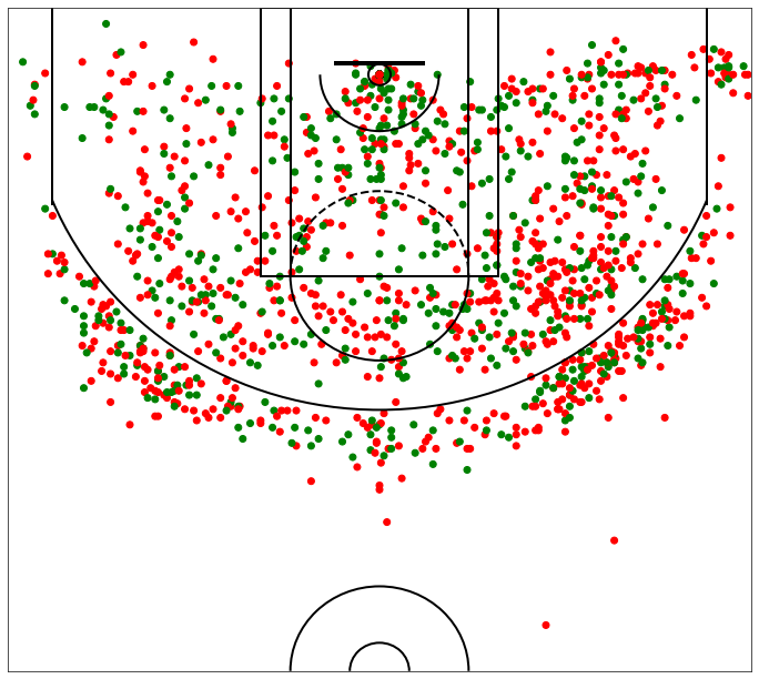
First, let’s create a scatter plot of Kobe’s shots from 2007 to 2008 and color his missed shots red and made shots green
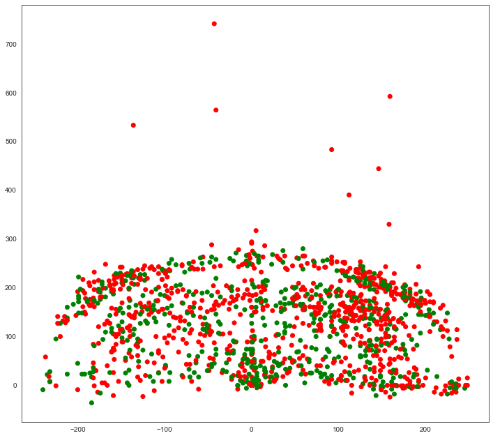
Note: The plot above represents an inversion of the data where the x-axis values are not on the correct side of the court. We can plot only shots in the “Right Side(R)” shot zone area to see the inversion. The plot below demonstrates how shots categorized as taken from the “Right Side(R)”, while to the viewers right, are actually to the left side of the hoop. This is something we will need to fix when creating our final shot chart.
To draw our court, we can roughly estimate that the center of the hoop is at the origin (0,0) of the Cartesian grid. We can also estimate that every 10 units on either the X and Y axes represents one foot. We can verify this by just look at observations in our shot_chart DataFrame. The shot range for the first shot is characerized as “Less Than 8 ft.”, the shot appears to be taken at the basket with the LOC_Y equal to 0. The second shot is categorized as “16-24 ft.” and the LOC_Y value is 201 suggested that every ten units equats to one feet (the shot appears to be taken 20 feet from the basket).
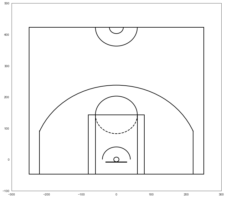
The dimensions of a basketball court can be seen here
Faye used the court dimensions along with matplotlib objects such as Circle, Rectangle, and Arc objects to draw our court. The function draw_court encapsualtes all the court spatial knowledge and visual represenations
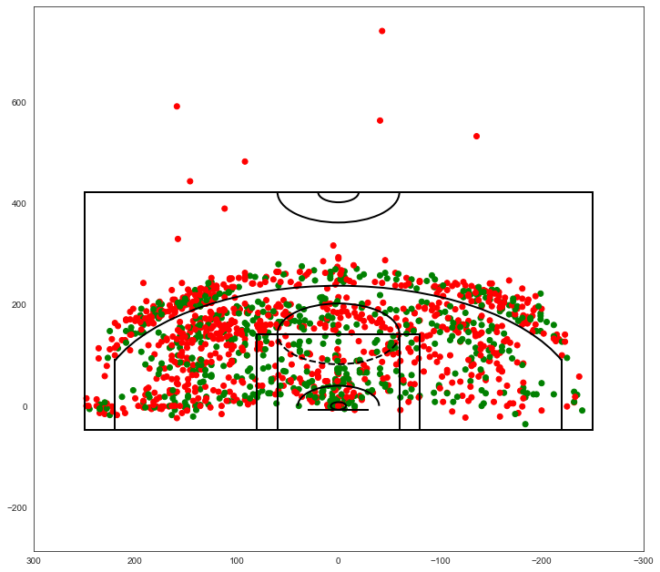
our next step is to overlay the scatter plot of shot location on the NBA court. when we overlay the NBA court, we can see that the furthest shots Kobe attempted were beyond half court and likely desperation heaves at the end of the quarter (we can confirm by inspecting further)
Code
plt.figure(figsize=(12,11))colors = {'Made Shot':'green', 'Missed Shot':'red'}plt.scatter(kobe_2008_shots_df.LOC_X, kobe_2008_shots_df.LOC_Y, c=kobe_2008_shots_df.EVENT_TYPE.map(colors))draw_court(outer_lines=True)# Descending values along the axis from left to rightplt.xlim(300,-300)plt.show()
Lets orient our shot chart with the hoop by the top of the chart, which is the same orientation as the shot charts on stats.nba.com. We do this by settting descending y-values from the bottom to the top of the y-axis. When we do this we no longer need to adjust the x-values of our plot.
Code
plt.figure(figsize=(12,11))colors = {'Made Shot':'green', 'Missed Shot':'red'}plt.scatter(kobe_2008_shots_df.LOC_X, kobe_2008_shots_df.LOC_Y, c=kobe_2008_shots_df.EVENT_TYPE.map(colors))draw_court()# Adjust plot limits to just fit in half courtplt.xlim(-250,250)# Descending values along th y axis from bottom to top# in order to place the hoop by the top of plotplt.ylim(422.5, -47.5)# get rid of axis tick labelsplt.tick_params(labelbottom=False, labelleft=False)plt.show()
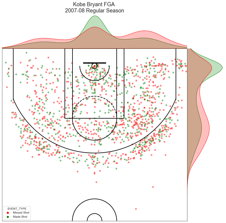
Lets start creating a version 1 of Goldsberry’s shot charts using the jointplot function from seaborn. jointplot adds a frequency dimension to the shot locations and is the first step to adding spatial analytics to our shot chart
Code
# create our jointplotjoint_shot_chart = sns.jointplot(x=kobe_2008_shots_df.LOC_X, y=kobe_2008_shots_df.LOC_Y, hue=kobe_2008_shots_df.EVENT_TYPE, palette=['red', 'green'], kind='scatter', space=0, alpha=0.5)joint_shot_chart.fig.set_size_inches(12,11)# A joint plot has 3 Axes, # the first one called ax_joint is the one we want to draw our court onto and adjust some other settingsax = joint_shot_chart.ax_jointdraw_court(ax)# Adjust the axis limits and orientation of the plot in order to plot half court# with the hoop by the top of the plotax.set_xlim(-250,250)ax.set_ylim(422.5, -47.5)# Get rid of axis labels and tick marksax.set_xlabel('')ax.set_ylabel('')ax.set_xticklabels('')ax.set_yticklabels('')# Add a titleax.set_title(f'Kobe Bryant FGA \n2007-08 Regular Season', y=1.2, fontsize=18)plt.show()
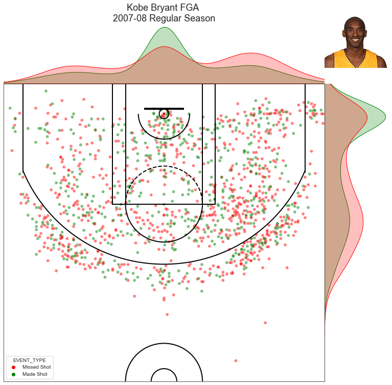
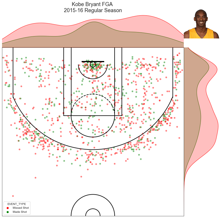
we can further customize this V1 shot chart by adding an image of the player, using the player id that we first retrieved from the NBA player database, we can use the get_player_pic function to retrieve a player’s pic from the nba.com
Code
def get_player_pic(player_id):# we pass in the link to the image as the 1st argument# the 2nd argument tells urlretrieve what we want to scrape player_pic_address = urllib.request.urlretrieve(f"http://stats.nba.com/media/players/230x185/{player_id}.png","{player_id}.png")# urlretrieve returns a tuple with our image as the first # element and imread reads in the image as a # mutlidimensional numpy array so matplotlib can plot it player_pic = plt.imread(player_pic_address[0])return(player_pic)
now let’s add our player image to the V1 of the shot chart
Code
# create our jointplotjoint_shot_chart_2008 = sns.jointplot(x=kobe_2008_shots_df.LOC_X, y=kobe_2008_shots_df.LOC_Y, hue=kobe_2008_shots_df.EVENT_TYPE, palette=['red', 'green'], kind='scatter', space=0, alpha=0.5)joint_shot_chart_2008.fig.set_size_inches(12,11)# A joint plot has 3 Axes, # the first one called ax_joint is the one we want to draw our court onto and adjust some other settingsax = joint_shot_chart.ax_jointdraw_court(ax)# Adjust the axis limits and orientation of the plot in order to plot half court# with the hoop by the top of the plotax.set_xlim(-250,250)ax.set_ylim(422.5, -47.5)# Get rid of axis labels and tick marksax.set_xlabel('')ax.set_ylabel('')ax.set_xticklabels('')ax.set_yticklabels('')# Add a titleax.set_title('Kobe Bryant FGA \n2007-08 Regular Season', y=1.2, fontsize=18)# Add Kobe's image to the top right# First create our OffSetImage by passing in our image# and set the zoom level to make the image small enough to fit on our plotimg = OffsetImage(kobe_player_pic, zoom=0.6)# Pass in a tuple of x,y coordinates to set_offsetimg.set_offset((625,621))# add the imageax.add_artist(img)plt.show()
the function create_joint_shot_chart wraps the previous code into a function with the inputs for
shot dataframe
plot title
picture dictionary: optional, defaults to empty dictionary
otherwise enter dictionary with keys for include_pic and player_pic
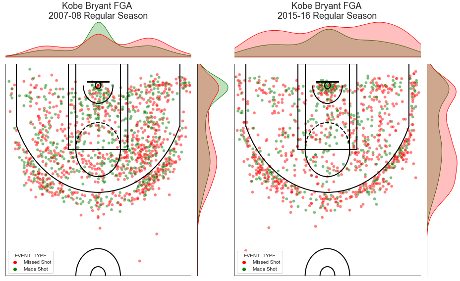
let’s create a jointplot for Kobe’s 2016 season using the create_joint_shot_chart and compare with his 2008 season.
Some interesting takeaways from the histograms provided by the jointplot function. Looking at the side-by-side plot of Kobe’s shooting performance (below) * we can see the frequency and efficiency that Kobe attacked the restricted area in his MVP season. + Kobe made more field goals than he missed from 0-4 ft from the basket, a feat usually reserved for NBA “bigs” (individuals playing the Center or Power Forward possition) * conversely, we see the decline in Kobe’s efficiency his final year where there was no area where he made more field goals than he missed
* Kobe also shot more from the right side of the court than the left, not surprising for a right-handed player * the incredible spread and verstality in shot selection, Kobe shot from everywhere in both years shown + V2 of the shot chart will let us know how efficiently he shot relative to other areas on the court
In Part 2 of this series, we will modularize aspects of this notebook including getting shot chart data and begin applying Goldsberry’s spatial analytics contributions
Code
fig = plt.figure(figsize=(13,8))fig.subplots_adjust(top=0.95) # Reduce plot to make roomgs = gridspec.GridSpec(1, 2)mg0 = SeabornFig2Grid(joint_shot_chart, fig, gs[0])mg1 = SeabornFig2Grid(joint_shot_chart_2016, fig, gs[1])gs.tight_layout(fig)