The goal of this post is to visualize flights taken from Google location data using Python * This post utilizes code from Tyler Hartley’s visualizing location history blog post
Overview
Setup
download data
install modules
Data Wrangling
data extraction
data manipulation
Flight Algorithm
Visualize Flights
Conclusion
Setup
Use Google Takout to download your Google location history
If you’ve previously enabled Google location reporting on your smartphone, your GPS data will be periodically uploaded to Google’s servers. Use Google Takeout to download your location history.
The decisions of when and how to upload this data are entirely obfuscated to the end user, but as you’ll see below, Android appears to upload a GPS location every 60 seconds. That’s plenty of data to work with.
After downloading your data, install the required modules
Google Takeout
Google Takeout is a Google service that allows users to export any personal Google data. We’ll use Takeout to download our raw location history as a one-time snapshot. Since Latitude was retired, no API exists to access location history in real-time.
Download location data: * Go to takeout. Uncheck all services except “Location History” * The data will be in a json format, which works great for us. Download it in your favorite compression type. * When Google has finished creating your archive, you’ll get an email notification and a link to download. * Download and unzip the file, and you should be looking at a LocationHistory.json file. Working with location data in Pandas. Pandas is an incredibly powerful tool that simplifies working with complex datatypes and performing statistical analysis in the style of R. Chris Albon has great primers on using Pandas here under the “Data Wrangling” section.
Install modules
If you use Anaconda to manage your Python packages, I recommend creating a virtual environment with anaconda to install the dependencies. Copying the lines below the instruction into the terminal creates the environment, requirements.txt, etc.
After completing the setup, we’ll read in the LocationHistory.json file from Google Takeout and create a DataFrame.
Code
import matplotlib.pyplot as pltimport numpy as npimport pandas as pdfrom mpl_toolkits.basemap import Basemapfrom shapely.geometry import Point, Polygon, MultiPoint, MultiPolygonfrom shapely.prepared import prepimport fionafrom matplotlib.collections import PatchCollectionfrom descartes import PolygonPatchimport jsonimport datetimefrom IPython.display import Image
/Users/kivan/anaconda3/envs/py27/lib/python2.7/site-packages/matplotlib/font_manager.py:273: UserWarning: Matplotlib is building the font cache using fc-list. This may take a moment.
  warnings.warn('Matplotlib is building the font cache using fc-list. This may take a moment.')
Data Wrangling
data extraction
Code
withopen('LocationHistory.json', 'r') as fh: raw = json.loads(fh.read())# use ld as an abbreviation for location datald = pd.DataFrame(raw['locations'])del raw #free up some memory# convert to typical unitsld['latitudeE7'] = ld['latitudeE7']/float(1e7) ld['longitudeE7'] = ld['longitudeE7']/float(1e7)ld['timestampMs'] = ld['timestampMs'].map(lambda x: float(x)/1000) #to secondsld['datetime'] = ld.timestampMs.map(datetime.datetime.fromtimestamp)# Rename fields based on the conversions we just didld.rename(columns={'latitudeE7':'latitude', 'longitudeE7':'longitude', 'timestampMs':'timestamp'}, inplace=True)ld = ld[ld.accuracy <1000] #Ignore locations with accuracy estimates over 1000mld.reset_index(drop=True, inplace=True)
data manipulation
Degrees and Radians
We’re going to convert the degree-based geo data to radians to calculate distance traveled. I’m going to paraphrase an explanation (source below) about why the degree-to-radians conversion is necessary
Degrees are arbitrary because they’re based on the sun and backwards because they are from the observer’s perspective.
Radians are in terms of the mover allowing equations to “click into place”. Converting rotational to linear speed is easy, and ideas like sin(x)/x make sense.
Consult this post for more info about degrees and radians in distance calculation.
convert degrees to radians
Code
degrees_to_radians = np.pi/180.0ld['phi'] = (90.0- ld.latitude) * degrees_to_radians ld['theta'] = ld.longitude * degrees_to_radians# Compute distance between two GPS points on a unit sphereld['distance'] = np.arccos( np.sin(ld.phi)*np.sin(ld.phi.shift(-1)) * np.cos(ld.theta - ld.theta.shift(-1)) + np.cos(ld.phi)*np.cos(ld.phi.shift(-1)) ) *6378.100# radius of earth in km
Now flightdata contains a comparison of each adjacent GPS location.
All that’s left to do is filter out the true flight instances from the rest of them.
spherical distance function
function to calculate straight-line distance traveled on a sphere
Code
def distance_on_unit_sphere(lat1, long1, lat2, long2):# http://www.johndcook.com/python_longitude_latitude.html# Convert latitude and longitude to spherical coordinates in radians. degrees_to_radians = np.pi/180.0# phi = 90 - latitude phi1 = (90.0- lat1)*degrees_to_radians phi2 = (90.0- lat2)*degrees_to_radians# theta = longitude theta1 = long1*degrees_to_radians theta2 = long2*degrees_to_radians cos = (np.sin(phi1)*np.sin(phi2)*np.cos(theta1 - theta2) + np.cos(phi1)*np.cos(phi2)) arc = np.arccos( cos )# Remember to multiply arc by the radius of the earth # in your favorite set of units to get length.return arc
Flight algorithm
filter flights
remove flights using conservative selection criteria
Code
flights = flightdata[(flightdata.speed >40) & (flightdata.distance >80)].reset_index()# Combine instances of flight that are directly adjacent # Find the indices of flights that are directly adjacent_f = flights[flights['index'].diff() ==1]adjacent_flight_groups = np.split(_f, (_f['index'].diff() >1).nonzero()[0])# Now iterate through the groups of adjacent flights and merge their data into# one flight entryfor flight_group in adjacent_flight_groups: idx = flight_group.index[0] -1#the index of flight termination flights.ix[idx, ['startlat', 'startlon', 'startdatetime']] = [flight_group.iloc[-1].startlat, flight_group.iloc[-1].startlon, flight_group.iloc[-1].startdatetime]# Recompute total distance of flight flights.ix[idx, 'distance'] = distance_on_unit_sphere(flights.ix[idx].startlat, flights.ix[idx].startlon, flights.ix[idx].endlat, flights.ix[idx].endlon)*6378.1# Now remove the "flight" entries we don't need anymore.flights = flights.drop(_f.index).reset_index(drop=True)# Finally, we can be confident that we've removed instances of flights broken up by# GPS data points during flight. We can now be more liberal in our constraints for what# constitutes flight. Let's remove any instances below 200km as a final measure.flights = flights[flights.distance >200].reset_index(drop=True)
This algorithm worked 100% of the time for me - no false positives or negatives. But the adjacency-criteria of the algorithm is fairly brittle. The core of it centers around the assumption that inter-flight GPS data will be directly adjacent to one another. That’s why the initial screening on line 1 of the previous cell had to be so liberal.
Now, the flights DataFrame contains only instances of true flights which facilitates plotting with Matplotlib’s Basemap. If we plot on a flat projection like tmerc, the drawgreatcircle function will produce a true path arc just like we see in the in-flight magazines.
Visualize Flights
Code
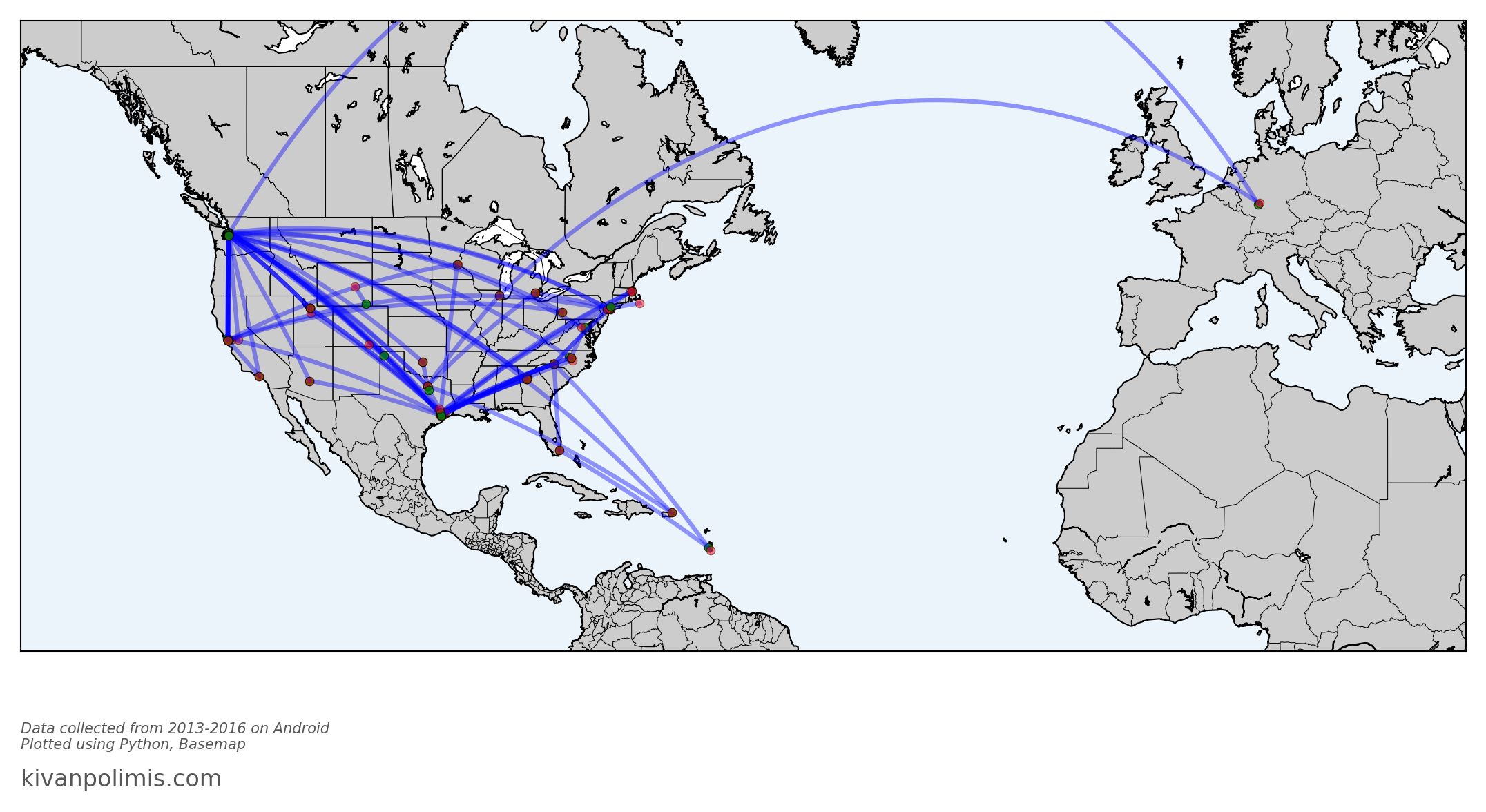
import matplotlib.pyplot as pltimport numpy as npimport pandas as pdfrom mpl_toolkits.basemap import Basemapfig = plt.figure(figsize=(18,12))# Plotting across the international dateline is tough. One option is to break up flights# by hemisphere. Otherwise, you'd need to plot using a different projection like 'robin'# and potentially center on the Int'l Dateline (lon_0=-180)# flights = flights[(flights.startlon < 0) & (flights.endlon < 0)]# Western Hemisphere Flights# flights = flights[(flights.startlon > 0) & (flights.endlon > 0)] # Eastern Hemisphere Flightsxbuf =0.2ybuf =0.35minlat = np.min([flights.endlat.min(), flights.startlat.min()])minlon = np.min([flights.endlon.min(), flights.startlon.min()])maxlat = np.max([flights.endlat.max(), flights.startlat.max()])maxlon = np.max([flights.endlon.max(), flights.startlon.max()])width = maxlon - minlonheight = maxlat - minlatm = Basemap(llcrnrlon=minlon - width* xbuf, llcrnrlat=minlat - height*ybuf, urcrnrlon=maxlon + width* xbuf, urcrnrlat=maxlat + height*ybuf, projection='merc', resolution='l', lat_0=minlat + height/2, lon_0=minlon + width/2,)m.drawmapboundary(fill_color='#EBF4FA')m.drawcoastlines()m.drawstates()m.drawcountries()m.fillcontinents()for idx, f in flights.iterrows(): m.drawgreatcircle(f.startlon, f.startlat, f.endlon, f.endlat, linewidth=3, alpha=0.4, color='b' ) m.plot(*m(f.startlon, f.startlat), color='g', alpha=0.8, marker='o') m.plot(*m(f.endlon, f.endlat), color='r', alpha=0.5, marker='o' )fig.text(0.125, 0.18, "Data collected from 2013-2016 on Android \nPlotted using Python, Basemap", ha='left', color='#555555', style='italic')fig.text(0.125, 0.15, "kivanpolimis.com", color='#555555', fontsize=16, ha='left')plt.savefig('flights.png', dpi=150, frameon=False, transparent=False, bbox_inches='tight', pad_inches=0.2)
Code
Image(filename='flights.png')
You can draw entertaining conclusions from the flight visualization. For instance, you can see some popular layover locations, all those lines in/out of Seattle, plus a recent trip to Germany. And Basemap has made it so simple for us - no Shapefiles to import because all map information is included in the Basemap module.
I can even calculate all the skymiles I should have earned these last 3 years with a single line of code:
Code
flights.distance.sum()*.621371# distance column is in km, convert to miles
91193.838483120751
Conclusion
You’ve now got the code to go ahead and reproduce these maps.
I’m working on creating functions to automate these visualizations
Potential future directions
Figure out where you usually go on the weekends
Calculate your fastest commute route
measure the amount of time you spend driving vs. walking.