The goal of this post is to visualize time spent in various Seattle neighborhoods using Google location data and Python * This post utilizes code from Tyler Hartley’s visualizing location history blog post
Overview
Setup
download data
install modules
Data Wrangling
data extraction
Working with Shapefiles in Python
Prep data and pare down locations
Compute your measurement metric
Choropleth Plot
Hexbin Map
Setup
Use Google Takout to download your Google location history
If you’ve previously enabled Google location reporting on your smartphone, your GPS data will be periodically uploaded to Google’s servers. Use Google Takeout to download your location history.
The decisions of when and how to upload this data are entirely obfuscated to the end user, but as you’ll see below, Android appears to upload a GPS location every 60 seconds. That’s plenty of data to work with.
After downloading your data, install the required modules
Google Takeout
Google Takeout is a Google service that allows users to export any personal Google data. We’ll use Takeout to download our raw location history as a one-time snapshot. Since Latitude was retired, no API exists to access location history in real-time.
Download location data: * Go to takeout. Uncheck all services except “Location History” * The data will be in a json format, which works great for us. Download it in your favorite compression type. * When Google has finished creating your archive, you’ll get an email notification and a link to download. * Download and unzip the file, and you should be looking at a LocationHistory.json file. Working with location data in Pandas. Pandas is an incredibly powerful tool that simplifies working with complex datatypes and performing statistical analysis in the style of R. Chris Albon has great primers on using Pandas here under the “Data Wrangling” section.
Install modules
If you use Anaconda to manage your Python packages, I recommend creating a virtual environment with anaconda to install the dependencies. Copying the lines below the instruction into the terminal creates the environment, requirements.txt, etc.
After completing the setup, we’ll read in the LocationHistory.json file from Google Takeout and create a DataFrame.
Code
import jsonimport timeimport fionaimport datetimeimport numpy as npimport pandas as pdimport matplotlib.pyplot as pltfrom mpl_toolkits.basemap import Basemapfrom shapely.prepared import prepfrom pysal.esda.mapclassify import Natural_Breaksfrom shapely.geometry import Point, Polygon, MultiPoint, MultiPolygonfrom matplotlib.collections import PatchCollectionfrom descartes import PolygonPatchfrom IPython.display import Imageimport warningswarnings.filterwarnings('ignore')
Data Wrangling
data extraction
Code
withopen('LocationHistory.json', 'r') as fh: raw = json.loads(fh.read())location_data = pd.DataFrame(raw['locations'])del raw #free up some memory# convert to typical unitslocation_data['latitudeE7'] = location_data['latitudeE7']/float(1e7) location_data['longitudeE7'] = location_data['longitudeE7']/float(1e7)location_data['timestampMs'] = location_data['timestampMs'].map(lambda x: float(x)/1000) #to secondslocation_data['datetime'] = location_data.timestampMs.map(datetime.datetime.fromtimestamp)# Rename fielocation_datas based on the conversions we just didlocation_data.rename(columns={'latitudeE7':'latitude', 'longitudeE7':'longitude', 'timestampMs':'timestamp'}, inplace=True)location_data = location_data[location_data.accuracy <1000] #Ignore locations with accuracy estimates over 1000mlocation_data.reset_index(drop=True, inplace=True)
location_data is a Pandas DataFrame containing all your location history and related info.
columns include latitude, longitude, and a timestamp. additional columns are accuracy, activity, altitude, heading, and velocity.
all we’ll need is latitude, longitude, and time.
Working with Shapefiles in Python
Shapefile is a widely-used data format for describing points, lines, and polygons. To work with shapefiles, Python gives us shapely. To read and write shapefiles, we’ll use fiona.
First up, you’ll need to download shapefile data for the part of the world you’re interested in plotting. I wanted to focus on my current home of Seattle, which like many cities provides city shapefile map data for free. It’s even broken into city neighborhoods! The US Census Bureau provides a ton of national shapefiles here. Your city likely provides this kind of data too. Tom MacWright has GIS with Python, Shapely, and Fiona overview for more detail on Python mapping with these tools
Next, we’ll need to import the Shapefile data we downloaded from the data.seattle.gov link above
The first step is to pare down your location history to only contain points within the map’s borders.
Code
# set up a map dataframedf_map = pd.DataFrame({'poly': [Polygon(hood_points) for hood_points in m.seattle],'name': [hood['S_HOOD'] for hood in m.seattle_info]})# Convert our latitude and longitude into Basemap cartesian map coordinatesmapped_points = [Point(m(mapped_x, mapped_y)) for mapped_x, mapped_y inzip(location_data['longitude'], location_data['latitude'])]all_points = MultiPoint(mapped_points)# Use prep to optimize polygons for faster computationhood_polygons = (MultiPolygon(list(df_map['poly'].values)))prepared_polygons = prep(hood_polygons)# Filter out the points that do not fall within the map we're makingcity_points_filter =filter(prepared_polygons.contains, all_points)city_points_list =list(city_points_filter)
Code
hood_polygons
Self-intersection at or near point 1373.2245930902682 17705.454459863173
Code
df_map.tail()
name
poly
116
North College Park
POLYGON ((7030.064427959046 23557.22768256248,...
117
Maple Leaf
POLYGON ((8132.34671963913 23955.72380105577, ...
118
Crown Hill
POLYGON ((5426.118400305284 23570.62258082016,...
119
Greenwood
POLYGON ((5823.505256198943 23565.24123078629,...
120
Sunset Hill
POLYGON ((2720.630502370794 22739.9815489074, ...
Code
print("total data points in this period: {}".format(len(all_points)))print("total data points in the city shape file for this period: {}".format(len(city_points_list)))percentage_in_city =round(len(city_points_list)/len(all_points),2)*100print("{}% of points this period are in the city shape file".format(percentage_in_city))
total data points in this period: 716017
total data points in the city shape file for this period: 292617
41.0% of points this period are in the city shape file
Now, city_points contains a list of all points that fall within the map and hood_polygons is a collection of polygons representing, in my case, each neighborhood in Seattle.
Compute your measurement metric
The raw data for my choropleth should be “number of points in each neighborhood.” With Pandas, again, it’s easy. (Warning - depending on the size of the city_points array, this could take a few minutes.)
udistrict_points =round(len(list(filter((df_map['poly'][41]).contains, city_points_list)))/len(city_points_list),2)*100print("{}% of points this in the city shape file are from the {}".format(udistrict_points, df_map['name'][41]))
93.0% of points this in the city shape file are from the University District
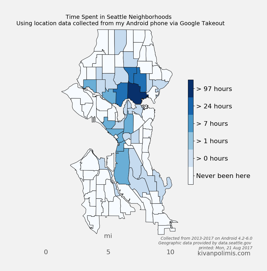
So now, df_map.hood_count contains a count of the number of GPS points located within each neighborhood. But what do those counts really mean? It’s not very meaningful knowing that I spent any n “counts” in a neighborhood, except to compare neighborhood counts against each other. And we could do that. Or we could convert hood_count into time
Turns out, converting counts into time is straightforward. From investigating the location history, it seems that unless the phone is off or without reception, Android reports you location exactly every 60 seconds. Not usually 60 seconds, not sometimes 74 seconds, every 60 seconds. It’s been true on Android 4.2-6.0. Hopefully that means it holds true for you, too. So if we make the assumption that my phone on 24/7 (true) and I have city-wide cellular reception (also true), then all we need to do is hood_count/60.0, as shown above, and now we’re talking in hours instead of counts.
Choropleth Plot
The code for creating this hexbin map below is in choropleth.py
Code
#%run choropleth.py
Code
# Check out the full post at http://beneathdata.com/how-to/visualizing-my-location-history/# for more information on the code belowbreaks = Natural_Breaks( df_map[df_map['hood_hours'].notnull()].hood_hours.values, initial=300, k=5)# the notnull method lets us match indices when joiningjb = pd.DataFrame({'jenks_bins': breaks.yb}, index=df_map[df_map['hood_hours'].notnull()].index)df_map['jenks_bins'] = jbdf_map.jenks_bins.fillna(-1, inplace=True)jenks_labels = ['Never been here', "> 0 hours"]+["> %d hours"%(perc) for perc in breaks.bins[:-1]]def custom_colorbar(cmap, ncolors, labels, **kwargs): """Create a custom, discretized colorbar with correctly formatted/aligned labels. cmap: the matplotlib colormap object you plan on using for your graph ncolors: (int) the number of discrete colors available labels: the list of labels for the colorbar. Should be the same length as ncolors. """from matplotlib.colors import BoundaryNormfrom matplotlib.cm import ScalarMappable norm = BoundaryNorm(range(0, ncolors), cmap.N) mappable = ScalarMappable(cmap=cmap, norm=norm) mappable.set_array([]) mappable.set_clim(-0.5, ncolors+0.5) colorbar = plt.colorbar(mappable, **kwargs) colorbar.set_ticks(np.linspace(0, ncolors, ncolors+1)+0.5) colorbar.set_ticklabels(range(0, ncolors)) colorbar.set_ticklabels(labels)return colorbarfigwidth =8fig = plt.figure(figsize=(figwidth, figwidth*height/width))ax = fig.add_subplot(111, axisbg='w', frame_on=False)cmap = plt.get_cmap('Blues')# draw neighborhoods with grey outlinesdf_map['patches'] = df_map['poly'].map(lambda x: PolygonPatch(x, ec='#111111', lw=.8, alpha=1., zorder=4))pc = PatchCollection(df_map['patches'], match_original=True)# apply our custom color values onto the patch collectioncmap_list = [cmap(val) for val in (df_map.jenks_bins.values - df_map.jenks_bins.values.min())/( df_map.jenks_bins.values.max()-float(df_map.jenks_bins.values.min()))]pc.set_facecolor(cmap_list)ax.add_collection(pc)#Draw a map scalem.drawmapscale(coords[0] +0.08, coords[1] +-0.01, coords[0], coords[1], 10., units='mi', fontsize=16, barstyle='fancy', labelstyle='simple', fillcolor1='w', fillcolor2='#000000', fontcolor='#555555', zorder=5, ax=ax,)# ncolors+1 because we're using a "zero-th" colorcbar = custom_colorbar(cmap, ncolors=len(jenks_labels)+1, labels=jenks_labels, shrink=0.5)cbar.ax.tick_params(labelsize=16)current_date = time.strftime("printed: %a, %d %b %Y", time.localtime())#fig.suptitle("Time Spent in Seattle Neighborhoods", fontdict={'size':24, 'fontweight':'bold'}, y=0.92)ax.set_title("Time Spent in Seattle Neighborhoods \n Using location data collected from my Android phone via Google Takeout", fontsize=14, y=1)ax.text(1.62, -.06, "Collected from 2013-2017 on Android 4.2-6.0\nGeographic data provided by data.seattle.gov \n%s"% (current_date), ha='right', color='#555555', style='italic', transform=ax.transAxes)ax.text(1.62, -.09, "kivanpolimis.com ", color='#555555', fontsize=15, ha='right', transform=ax.transAxes)plt.savefig('seattle_choropleth.png', dpi=100, frameon=False, bbox_inches='tight', pad_inches=0.5, facecolor='#F2F2F2')
Code
Image("seattle_choropleth.png")
Hexbin Map
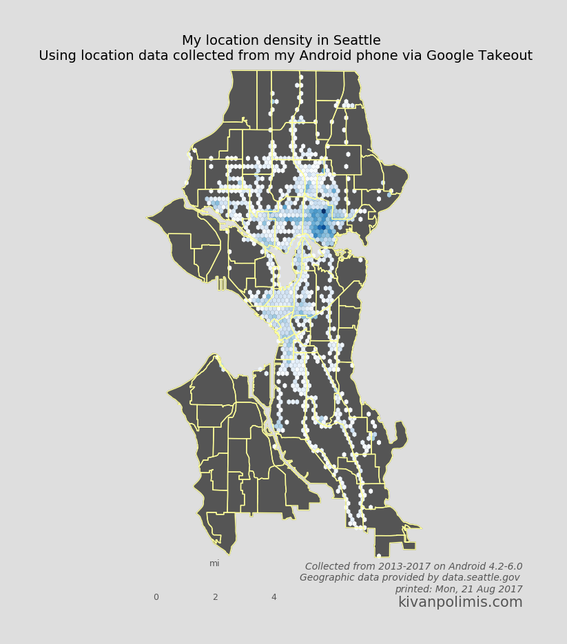
We can also take a different approach to choropleths, and instead of using each neighborhood polygon as a bin, let Basemap generate uniform hexagonal bins for us. Hexbin maps are great way to visualize point density because all bins are equally sized. Best of all, it requires essentially no extra work as we’ve already defined our neighborhood Patches and paired down our location data. The code for creating this hexbin map below is in hexbin.py
Code
#%run hexbin.py
Code
"""PLOT A HEXBIN MAP OF A LOCATION"""figwidth =8fig = plt.figure(figsize=(figwidth, figwidth*height/width))ax = fig.add_subplot(111, axisbg='w', frame_on=False)# draw neighborhood patches from polygonsdf_map['patches'] = df_map['poly'].map(lambda x: PolygonPatch( x, fc='#555555', ec='#555555', lw=1, alpha=1, zorder=0))# plot neighborhoods by adding the PatchCollection to the axes instanceax.add_collection(PatchCollection(df_map['patches'].values, match_original=True))# the mincnt argument only shows cells with a value >= 1# The number of hexbins you want in the x-directionnumhexbins =50hx = m.hexbin( np.array([geom.x for geom in city_points_list]), np.array([geom.y for geom in city_points_list]), gridsize=(numhexbins, int(numhexbins*height/width)), #critical to get regular hexagon, must stretch to map dimensions bins='log', mincnt=1, edgecolor='none', alpha=1., cmap=plt.get_cmap('Blues'))# Draw the patches again, but this time just their borders (to achieve borders over the hexbins)df_map['patches'] = df_map['poly'].map(lambda x: PolygonPatch( x, fc='none', ec='#FFFF99', lw=1, alpha=1, zorder=1))ax.add_collection(PatchCollection(df_map['patches'].values, match_original=True))# Draw a map scalem.drawmapscale(coords[0] +0.05, coords[1] -0.01, coords[0], coords[1], 4., units='mi', barstyle='fancy', labelstyle='simple', fillcolor1='w', fillcolor2='#555555', fontcolor='#555555', zorder=5)#fig.suptitle("My location density in Seattle", fontdict={'size':54, 'fontweight':'bold'}, y=0.92)ax.set_title("My location density in Seattle \n Using location data collected from my Android phone via Google Takeout", fontsize=14, y=1)ax.text(1.35, -.06, "Collected from 2013-2017 on Android 4.2-6.0\nGeographic data provided by data.seattle.gov \n%s"% (current_date), ha='right', color='#555555', style='italic', transform=ax.transAxes)ax.text(1.35, -.09, "kivanpolimis.com", color='#555555', fontsize=15, ha='right', transform=ax.transAxes)plt.savefig('seattle_hexbin.png', dpi=100, frameon=False, bbox_inches='tight', pad_inches=0.5, facecolor='#DEDEDE')